idle gaze 065: in search of ungrammable spaces
What lies beyond the digital-content machines of third-wave coffeeshops, brand pop-ups and shoppy shops.
I’ve never made it to Milan Design Week, but I make a habit of browsing the ‘unmissable pop-ups’ articles and ‘best of’ top ten lists, to see what brand installations and design exhibitions are making the headlines. As someone who makes a living out of making sense of the zeitgeist, the industry event offers a rare moment in time when a large bulk of the creative class find themselves in one city, collectively reacting to the latest in aesthetics, materials, textures and colours.
On some level, it offers a window into the cutting edge of upcycled textiles, biomorphic shapes, modular furniture, and integrated greenery, but beyond the design innovations, what it seems to really be about, more than ever, is whipping up a sense of aesthetic lifestyle FOMO.
This year, enthusiastic aesthetes gushed over Marimekko and Apartamento’s Bar Unikko pop-up - a traditional Milanese café dressed up with poppy prints adorning every surface - and Highsnobiety’s Sbagliato-themed Bar Basso takeover (with an accompanying merch drop).
But no branded activation seemed to generate quite as much attention as Caffe Rimowa: a pop-up promoting the collaboration between the luggage company and Italian espresso machine manufacturer La Marzocco. Objectively, a very nice space, a marriage of brands that just makes sense. Two companies merging their expertise in high-end metals and machining, two kinds of chrome colliding into a thing of beauty.
The pop-up pushed all the potent levers of the modern aspiration economy: artisan coffee, sleek stainless surfaces, tastefully retro colour schemes and workshop-like streetwear outfits behind the counter. By combining forces, Rimowa and La Marzocco had - maybe inadvertently - shaped the perfect symbol of the modern digitally nomadic, international AirBnB lifestyle of which Milan Design Week represents in so many ways.
While this is an obviously successful recipe for drawing in crowds, a fair few critics have begged the question: is it possible to really stay true to the event’s ethos of experimentation and innovation if the exhibitors are designing spaces to fit with whatever increasingly narrow stylistic values are trending on social?
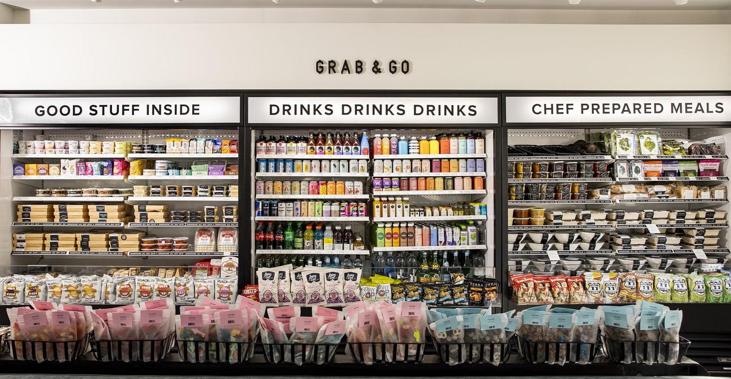
This perceived homogenisation of public spaces is happening everywhere. There’s the rise aesthetic “shoppy shops” - a term used to describe a certain kind of highly aesthetic retail location (most often a grocery store or bodega); stocked with tinned sardines, premium squeeze bottle olive oils and crunchy chili; the kind of pantry items that feature in countless TikTok videos.
Meanwhile, high-end restaurants all look increasingly the same, tastefully beige backdrops with visually dramatic dishes (like steak topped with a super-sized cacio-e-pepe filled ravioli), food designed to trigger the urge to snap a photo. One restaurant critic aptly described these establishments as “instagram fulfilment centres” (more on this back in idle gaze 035).
Kyle Chayka covers this destruction of nuance in his book Filterworld, where he documents the turning point in 2010 when public spaces started to be moulded, physically and literally, by the market advantage of luring patrons looking for highly instagrammable shots: “sufficiently minimalist to appear classy, possessing some aspect that seems covetable and exclusive, conducive to the square dimensions that the app mandated”.
Like moths to a flame, we’re drawn to these photogenic spaces. It’s second nature to think first “will this make great content?” before considering “will it actually be nice to spend time here?”
But that flame is beginning to falter. There’s another, more welcoming glow beyond the tree line, away from the panopticon of content capture. A renewed affection for places that would have up until recently been dismissed as dank, messy, outdated. You can find them in every city, hiding in plain sight: old school Italian joints with tomato sauce splashed against countertop surfaces, coffeeshops with ancient decorations, lunch spots with menus that haven’t been updated since the 90s.
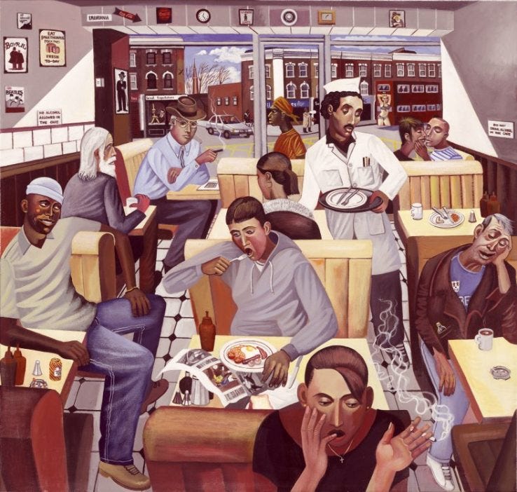
In London there’s a renewed appreciation of ‘caffs’ (documented lovingly by the likes of [non-aesthetic] Instagram accounts like caffs_not_cafes). Greasy spoons with gingham curtains, linoleum floors and laminate tables, with nothing on the menu but slight variations on an english breakfast. Nothing to drink but builders tea.
Every time I find myself in London I try to squeeze in a fry up at E Pellicci, an art deco adorned caff in Bethnal Green. Despite increasingly long lines of tourists outside hoping to experience a slice of UK nostalgia, there’s a staunch refusal to cave in to any pressure to modernise or pander to trending stylistic or service industry norms (the cash registers haven’t been updated since the 60s). The space retains a messy old school charm that can only be felt, an essence that could never be captured on camera. It feels like the Kray Twins, who used to famously frequent the premises 50 years ago, could walk in at any moment.

The fashion newsletter
coined a great term last year for these kind of places: “Un-Instagrammable-Hang-Zones”: warm, welcoming, unpretentious venues, like teahouses, coffeeshops, dive bars, pizza parlors, that proliferated in the ‘90s, back in the quainter, earlier days of globalization —“a lovely and welcoming place to actually hang out, in other words, the kind of place where you were not remotely tempted to indulge in the modern cyborg tic of whipping out yr phone and documenting yr visit for the timeline…”
Beyond the digital content machines of third-wave coffeeshops, brand pop-ups and shoppy shops, the sentimentality for Un-Instagrammable-Hang-Zones is about feeling sentimental for a time before the loneliness epidemic had become a defining characteristic of modern life. When ‘hanging’ was the main activity for which one would frequent a coffeeshop. Places to come as you are, relax, open up and feel at home. And don’t even bother wrangling a TikTok out of it, it’s too dark and messy, everything will come out blurry. You just had to be there.
And while entrepreneurial restaurateurs and brands on the prowl for emerging consumer desires have caught onto this yearning for more homely spaces, their futile attempts to replicate the Un-Instagrammable-Hang-Zone makes it evident they can neither be forced or co-opted.
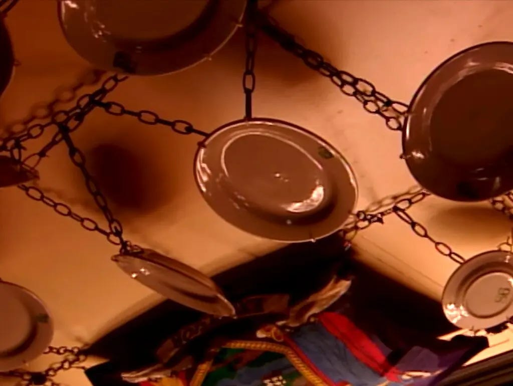
Cue all the eye-rolling going on around Frog Club, a newly opened and much hyped restaurant in NYC pulling out all the stops in it’s attempt to replicate a certain nostalgically musty aura. Reservations are made by email (not Resy), and photographs aren’t allowed inside. To enter, you have to cover the front and back cameras of your phone with stickers, to make it clear this not a place to TikTok their spinach soufflé into oblivion. The interior has been described as one early visitor as a ‘bondage den’, featuring “an almost laughable number of plates hung from chains overhead”..It was like Bemelmans Bar had ripped a few lines of adderall and decided to rewrite Frog and Toad.”
However, by forcing patrons to stop capturing content, and attempting to generate an artificial sense of mystique, it all feels a little contrived. As
over at wrote in her review of Frog Club: “don’t treat me like a child and put a sticker on my phone, give me free bread, allow walk-ins, and stop trying so hard”.Burberry is another brand which has recently been accused of trying too hard to break free from content optimised sterility. During London Fashion Week last year they announced a takeover of Norman’s, an iconic, cozy caff in the capital, and were broadly slated for “cosplaying British working class culture”. The pop-up was denounced as a crass misappropriation of an everyman institution by a not so everyman brand, with overpriced dishes served by staff wearing trendy matching and branded uniforms to serve influencers.
I’m writing this essay sat comfortably in Johnston Street Cafe in Collingwood, Melbourne, where there’s no aesthetic, overpriced dishes or Instagrammable backdrops. It’s a nondescript but very charming coffeeshop filled with rural knick knacks, old rusty farming tools, framed, fading pages from vintage cookbooks. There’s a crackling cast-iron fire place in the corner. There’s a certain patina in places like this that can only develop with time, and a patient commitment to never cave in to temporary fads. It’s too dark here and everything is far too dishevelled to even consider capturing content. Free from the pull of the algorithm, there’s space to just be.


In a way, we are talking cycles. Just like visual culture is moving away from the polished look of Instagram, towards the rawer TikTok aesthetics, Interior is - very slowly! - abandoning the manicured Instagram look, moving into a more no-nonsense territory.
When done well (usually it happens with places that have known no other look since their beginning) it's refreshing (but give it a few years and we'll go back to craving the other opposite). When, instead, there is an element of "trying-too-hard" and general fakery, as in the Frog Club or Burberry examples, it just reads pathetic.
Granted, true originals do more than just swing from one black-and-white style to its opposite.
Funny you should mention Foxtrot since they went out of business about a month ago. A hunger charity worked with the building's owner in the DC location to get in there to grab the food in the store so they could feed the homeless with what the business left behind. Maybe the shoppy shops are on their way out? https://www.cspdailynews.com/company-news/assets-shuttered-convenience-store-foxtrot-sold-22-million